Configuring PDF Templates
In this article
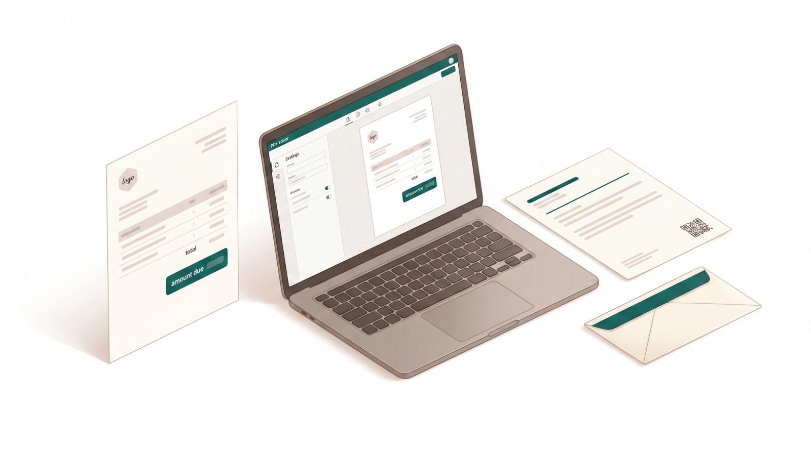
In this PDF (Invoices & Receipts) section, you can fully customize the layout of the files sent to customers via email or downloaded from their portal. Whether you need a detailed Invoice or a simple Receipt for quick orders, you control the design.
Contents
Contents
Why configure your PDF templates?
A default receipt gets the job done, but a customized invoice works harder for your business:
- Build Trust: Add your logo and brand colors to make every document look official and polished, reinforcing your professional image.
- Speed Up Payments: Highlight critical information like "Amount Due" or Payment QR Codes (PayNow) so customers can pay immediately without searching for bank details.
- Reduce Disputes: Choose exactly what information appears on the line items (e.g., "Service Type," "Unit Price," or "Tax Breakdown") so customers understand exactly what they are paying for without asking questions.
Accessing PDF Templates
Navigate to Settings > Templates and click on the PDF (Invoices & Receipts) card.
By default, EasyBiz provides two ready-to-use standard templates:
- Order Invoice: Typically used for requesting payment (shows Amount Due).
- Order Receipt: Typically used as proof of payment (shows Amount Paid).
You can edit these existing templates or click + Add to create a new one from scratch.
Global Configuration & Metadata
Before diving into the visual design, you must configure the file's properties on the left sidebar. These settings determine how the PDF file is named and how data is formatted throughout the document.
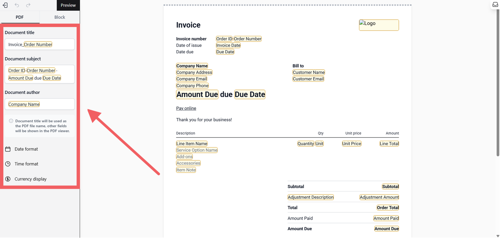
A. Document Properties
These fields are not visible on the paper design, but are embedded in the digital file itself:
- Document Title: This determines the actual filename of the PDF when a customer downloads it.
- Subject & Author: These appear in the PDF viewer's "File Properties."
Type the @ symbol in these fields to reveal a dropdown of Dynamic Variables.
- Example: Type
Invoice - @Order No→ The downloaded file will be named e.g. "Invoice - #1001.pdf".
B. Formatting Standards
Ensure the data matches your region's standards:
- Date Format: Choose how dates appear (e.g.,
DD/MM/YYYY,YYYY-MM-DD). - Time Format: Select between
12-Hour(01:00 PM) or24-Hour(13:00) clocks. - Currency Display: Control how prices look.
- Narrow Symbol:
$10.00 - Symbol:
SGD 10.00 - Code:
SGD 10.00 - No Symbol:
10.00
- Narrow Symbol:
Customizing the Layout (Block Settings)
The editor uses a Block System. Every element whether it's the logo, the "Total Amount," or the list of items is a block.
Click on any block in the preview area to open its Block Settings sidebar. Here is how you can customize each element:
A. Alignment & Positioning
- Block Align: Controls where the content sits inside the block (Left, Center, or Right).
- Vertical Align: For taller blocks, controls if content sits at the Top, Center, or Bottom.
B. Block Size (Width & Height)
You can control how much space a block takes up on the page:
- Auto: The block automatically adjusts its size based on the content inside it.
- Full: The block forces itself to take up the entire available width.
- Fractions: Useful for creating columns.
- Example: Setting two blocks to 1/2 makes them sit side-by-side (50% width each).
- Fixed Size: Manually select a specific pixel size (e.g.,
192for a specific sidebar width). - No Shrinking: Check this box if you want to prevent the block from getting smaller when the container around it shrinks.
C. Spacing (Padding)
Padding is the "breathing room" inside a block.
- Auto Scale: Let the system balance the spacing automatically.
- Manual: Uncheck auto-scale to set specific spacing for Top, Bottom, Left, or Right.
- Example: Setting
0means the text touches the edge. Setting96creates a large gap.
- Example: Setting
D. Visual Styling
- Background: Add a background color to a block (e.g., highlighting the "Total Due" section). You can select a color or input a Hex code.
- Rounded: Controls the corner radius of the block.
- None: Sharp square corners.
- SM to 3XL: Progressively rounder and softer corners.
- Full: Creates a pill-shape or circle.
E. Borders
To add a border, you must follow this 3-step order:
- Select Edges: Choose which sides need a line (Top, Bottom, Left, Right, or All).
- Set Width: Once an edge is selected, choose the thickness (1px is thin, 8px is thick).
- Set Color: Choose the line color (e.g., Gray-300 for a subtle divider, Black for a strong box).
Managing Blocks (The Toolbar)
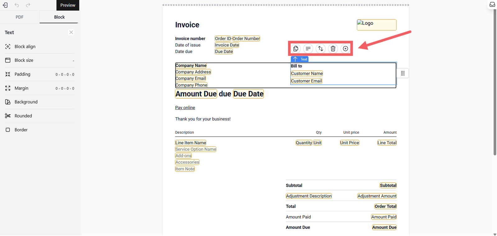
When you select a block, a floating toolbar appears next to it. Here is what each icon does:
A. Duplicate
Creates an exact copy of the selected block.
B. Alignment
Cycles through positions with each click.
- Horizontal Blocks: Toggles Left → Center → Right.
- Vertical Blocks: Toggles Top → Center → Bottom.
C. Move Actions (Menu)
Click to reveal a dropdown with four options:
- Move Up / Move Down: Reorders the block within the list.
- Wrap in Container: Puts the block inside a new "Box" (useful for grouping a Title and Value together).
- Extract from Container: Takes the block out of its current group.
D. Trash
Deletes the block permanently.
E. Plus (+)
Adds a new block (See next step below).
Adding New Blocks
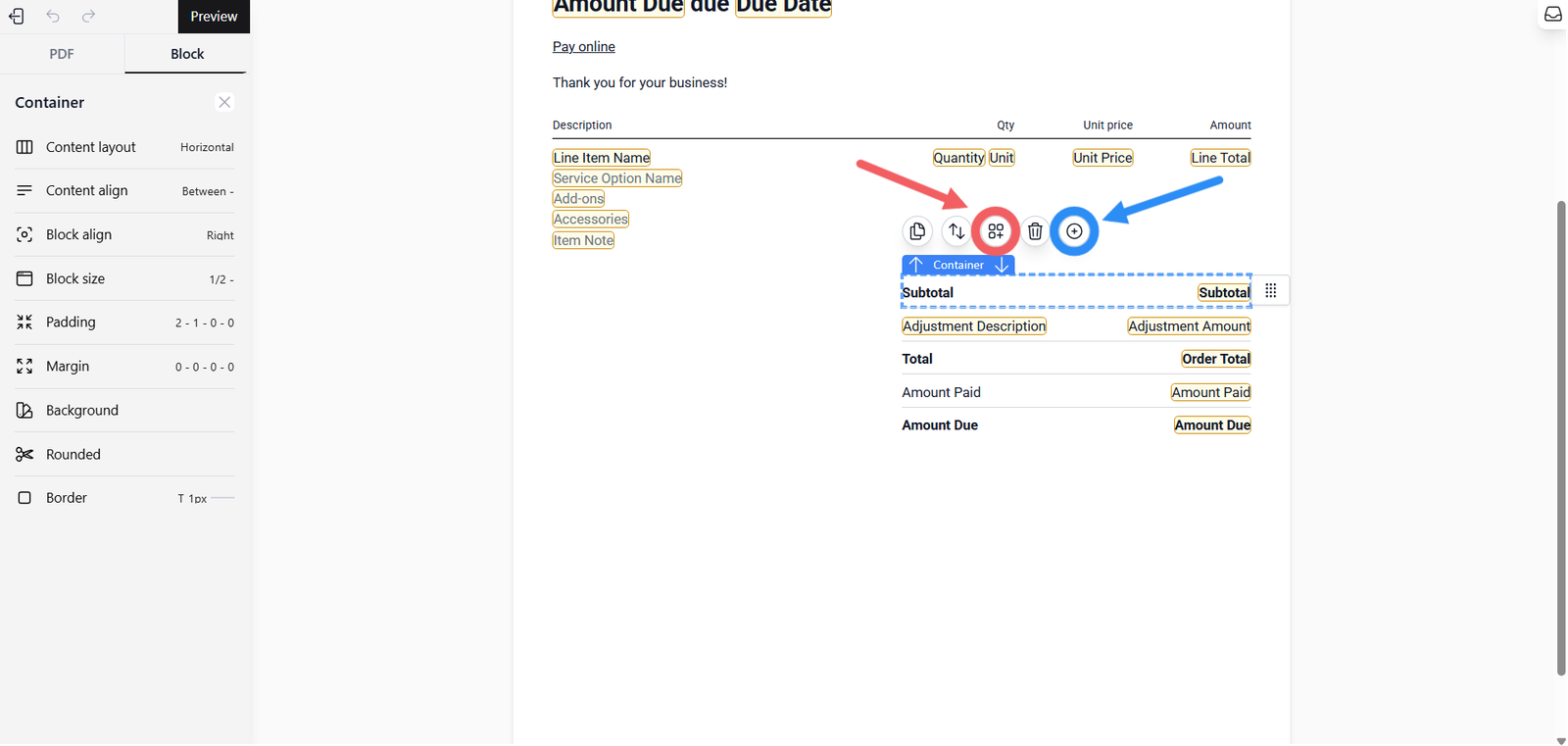
To add a new element (like text or an image), first click on any existing block on your canvas. The options available depend on what you have selected.
A. Adding a Block Next to an Item (+)
- Icon: The Plus (+) button.
- Where it goes: This adds a new block next to or below the item you selected.
- Availability: This appears on all block types (Text, Image, Containers, etc.).
B. Adding a Block Inside a Container
- Icon: The Add Child button (lly looks like a square/box icon next to the Plus button).
- Where it goes: This adds a new block inside the container box.
- Availability: This only appears when you select a Container block.
C. Selecting a Block Type
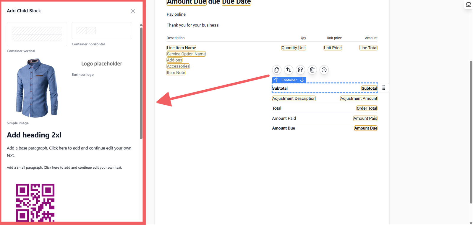
Once you click an add button, the Library opens on the left. You can choose from:
- Layout: Vertical Container (stacks items) or Horizontal Container (places items side-by-side).
- Text: Heading (2XL), Base Paragraph, Small Paragraph.
- Media: Image, Logo (uses your system logo), PayNow QR (Stripe or Manual).
- Dynamic Lists: Order Adjustment Items (lists changes made to an order e.g. Membership discount or extra services added).
Configuring Containers
Containers are "boxes" that hold other blocks. Their layout settings determine how the items inside them sit.
A. Vertical Container
Stacks items on top of each other (Top to Bottom).
B. Horizontal Container
Places items side-by-side (Left to Right).
C. Content Alignment:
- Horizontal Align: Controls where items sit (Start, Center, End, Space Between).
- Vertical Align: Controls the vertical position of items (Top, Middle, Bottom).
Image & Link Settings
When editing an Image Block (or Logo), you have specific options in the toolbar and sidebar:
A. Image Options
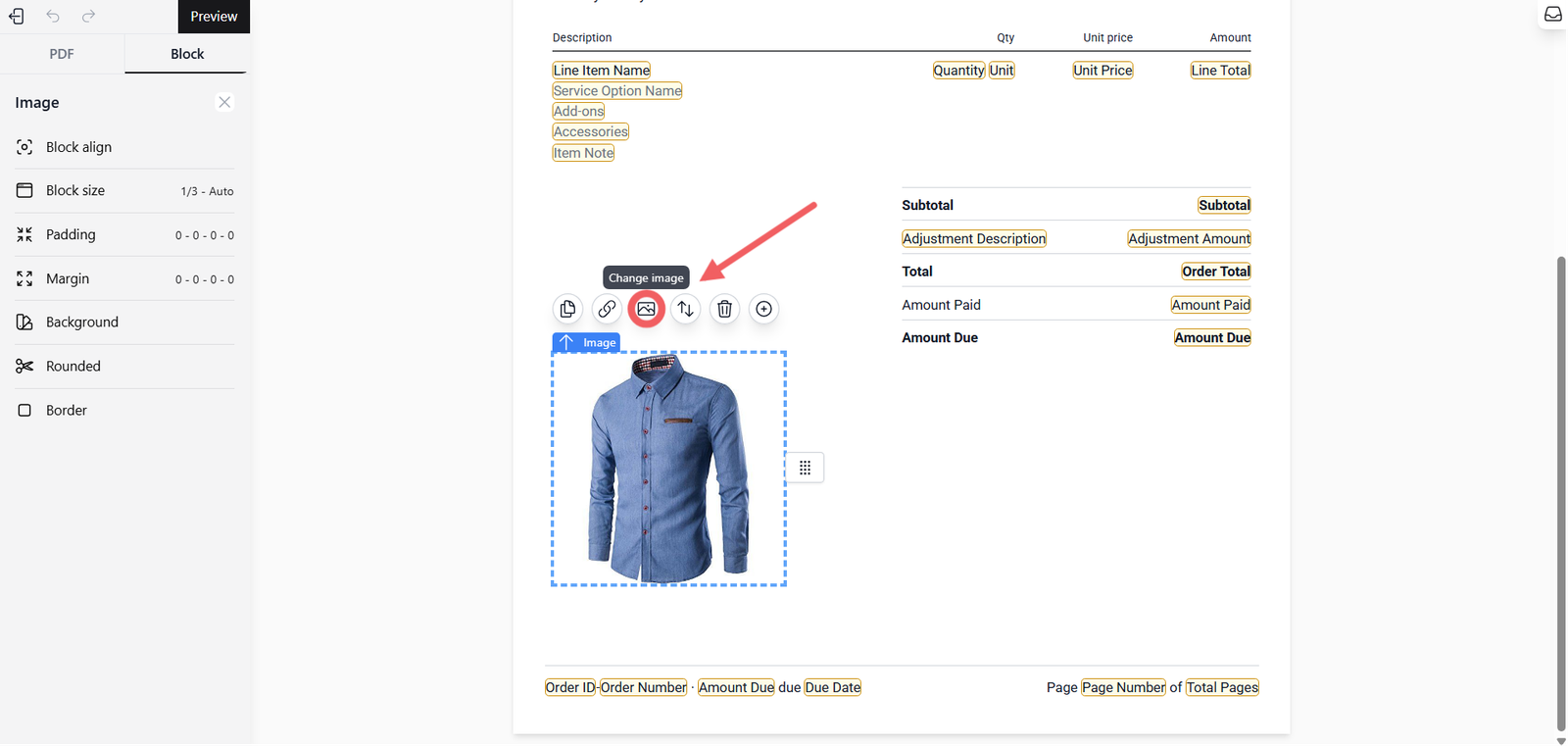
- Change Image: Upload a new picture to replace the current placeholder.
B. Link Configuration
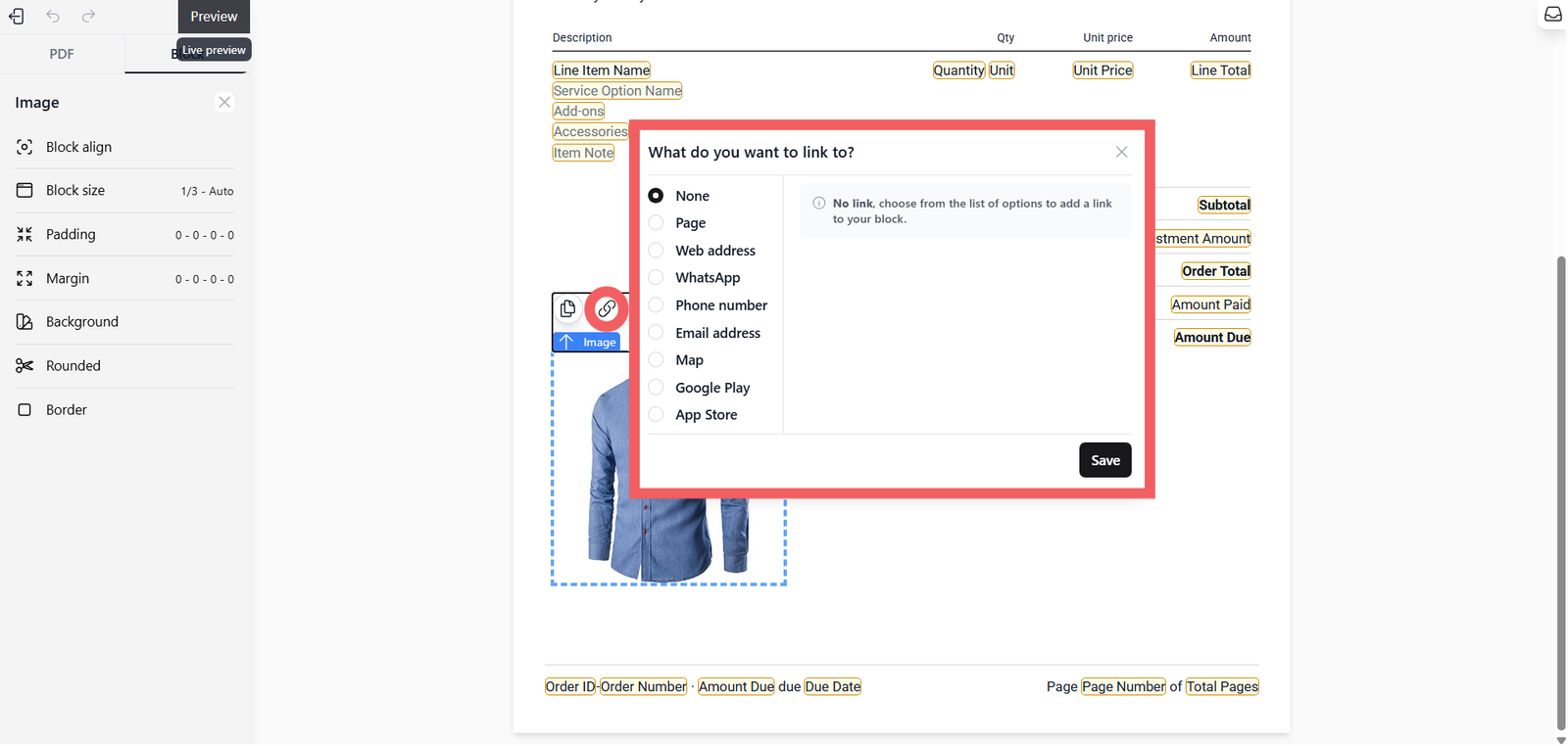
You can turn an image into a clickable button. Select the Link icon in the toolbar and choose a destination type:
- None: The image is not clickable.
- Page: Links to an internal page within the app (e.g., Order Detail, Home).
- Web Address: Paste an external URL (e.g.,
https://yourwebsite.com). - WhatsApp: Enter a phone number and a pre-filled message.
- Phone Number: Enter a phone number.
- Email: Enter a target email and subject line.
- Map: Enter a Google Maps link.
- Google Play: Enter the App Package Name (e.g.,
com.company.app). - App Store: Enter the App ID (numeric ID).
Previewing & Publishing
Before finalizing your template, ensure that dynamic data appears correctly.
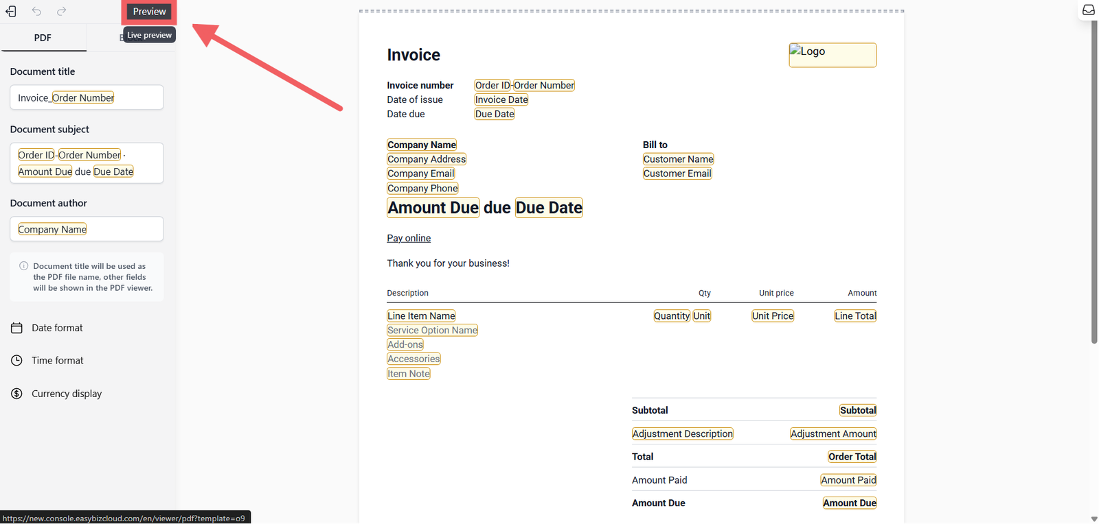
- Click the Preview bar at the top of the screen.
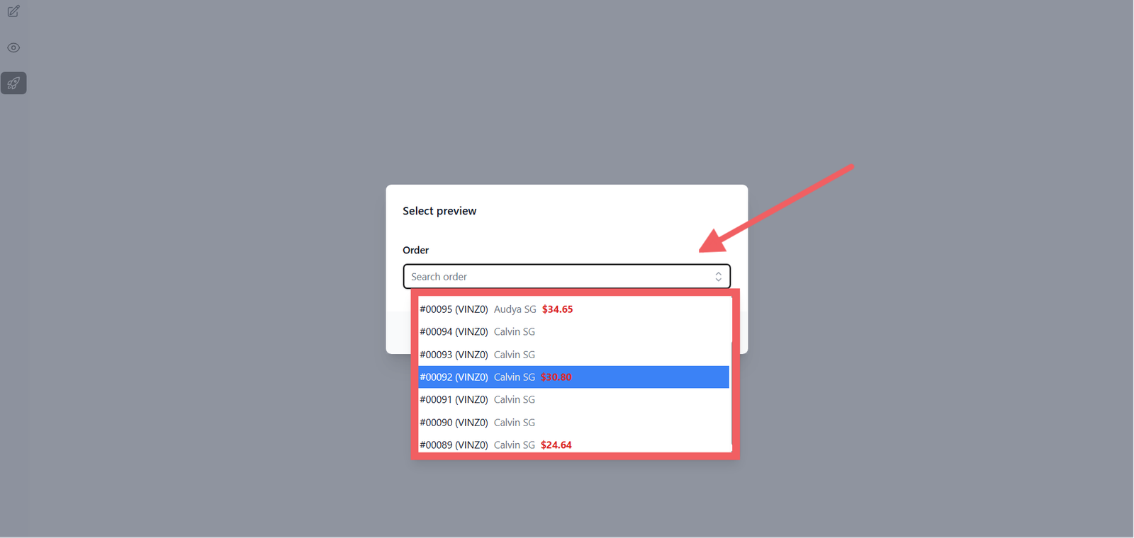
2. Select "Order to preview".
3. Choose a real order from your history.
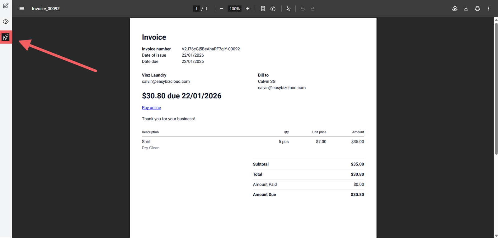
The editor will reload and populate all variables (e.g., @Customer Name, @Total) with data from that specific order. Once satisfied, click the Rocket Icon (Publish) in the left side of the screen.
Assigning to Business Units
Creating a template does not automatically apply it to your store. You must assign it manually.
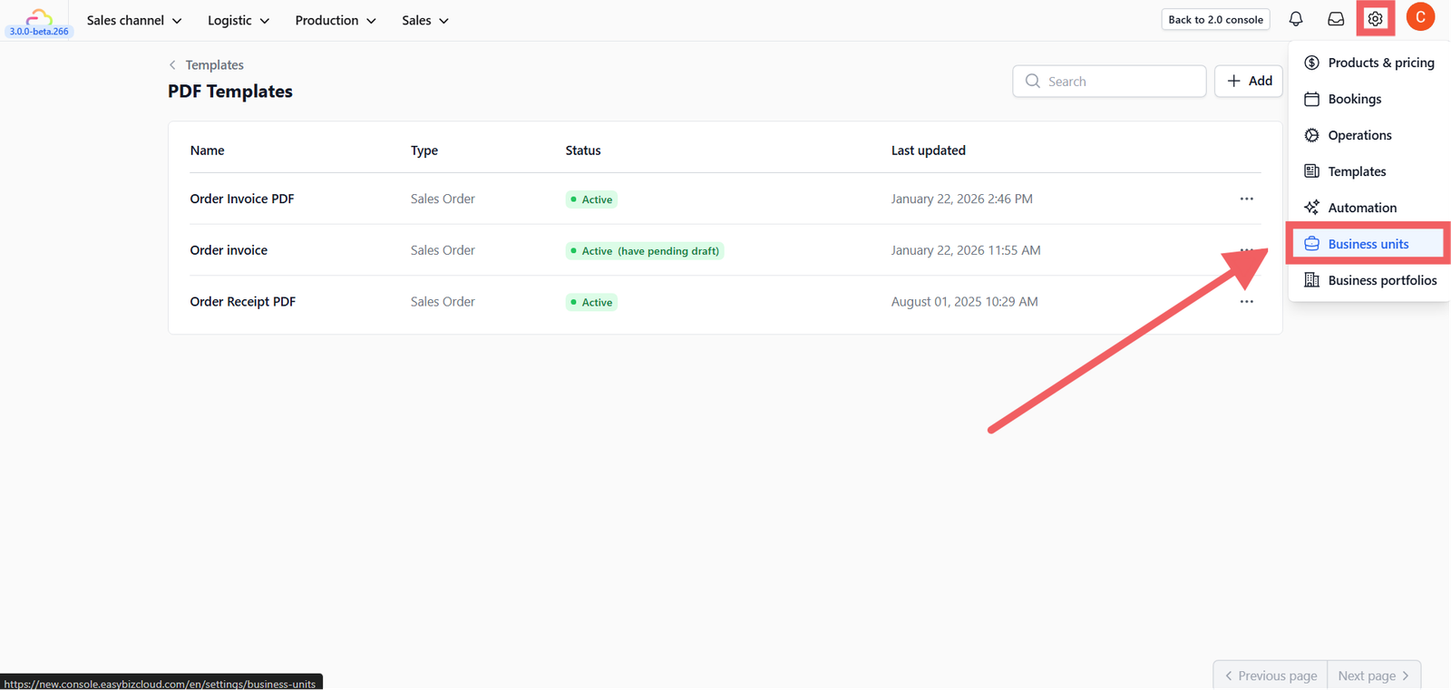
- Navigate to Settings > Business Units.
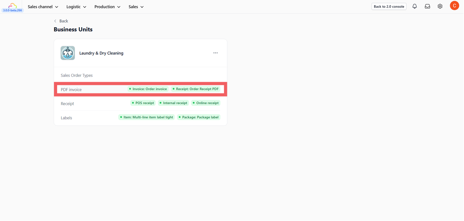
2. Select the specific unit (e.g., Laundry & Dry Cleaning).
3. Select to the PDF Invoice / Receipt section.
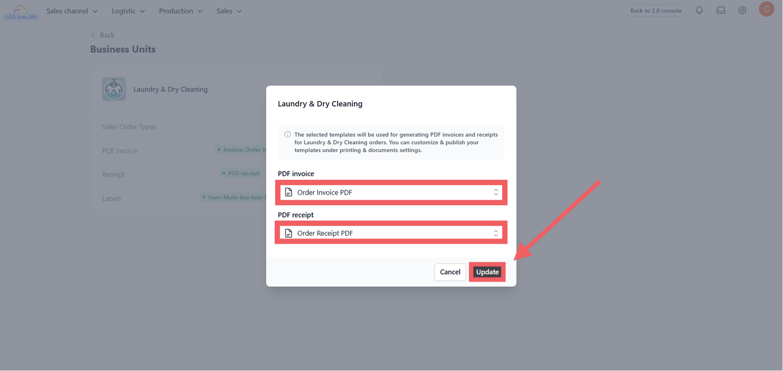
4. Select your newly published template from the dropdown list.
5. Click Update.
Give feedback
Up next
Configuring Whatsapp TemplatesStop typing the same messages manually. Learn how to create automated WhatsApp templates for orders, payments, and delivery updates.
Read more