Block Tab: Getting Started with the Visual Builder
In this article
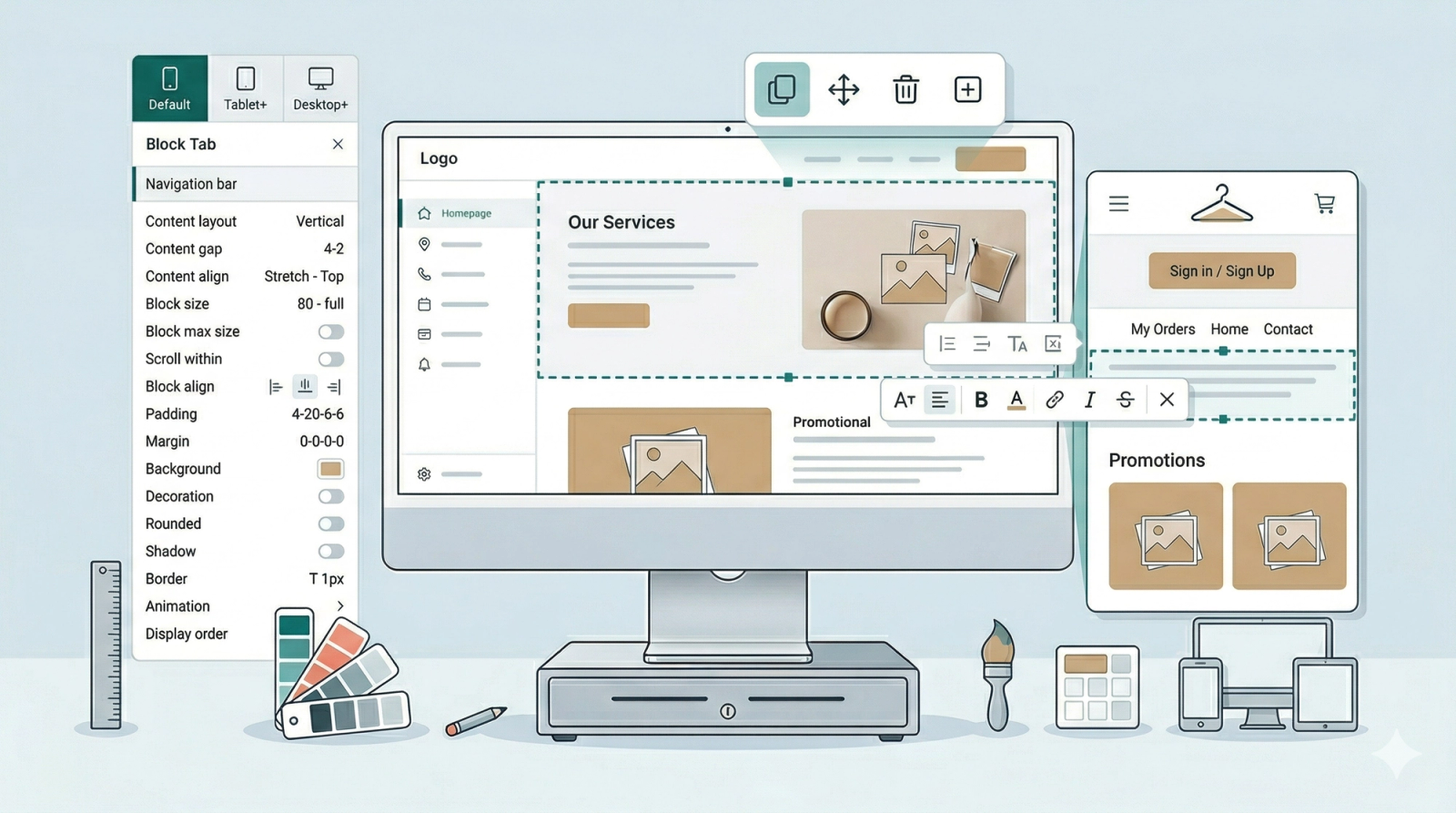
The Block Tab is where you customize the specific elements of your website. Similar to how you would format a slide in PowerPoint, this tab allows you to adjust font styles, change colors, swap images, and control the layout of individual pieces of content.
Contents
Contents
Getting Started
There are two ways to begin editing:
- Click-to-Edit: Click directly on any text, button, or image in the Website Preview on the right. The editor will automatically "jump" you to the Block Tab and open the settings for that specific item.
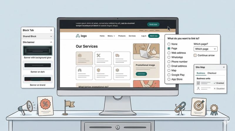
- Sidebar Selection: You can select a specific block from the Shared Block list. What differentiates these from a Section is that a Shared Block will appear on all of your pages if you choose to add them in. They are a block acting like a ready-made template filled with contents. The blocks includes:
- Navigation Bar: This contains the navigation to your most important pages, such as Home, My Orders, and Sign in/Sign up.
- Site Banner: Useful for promotions; this allows you to customize text to highlight special offers across your entire site.
- Chat Widget: One of the most important tools for a service business, allowing customers to reach out directly or via methods you added in the Site Tab.
The Quick Action Toolbar
Once you have selected a block, you will notice a small bar of icons appearing directly above the item in the Website Preview. Think of this as your Shortcuts Bar.

Most blocks share these four basic tools so you can make quick changes without using the sidebar:
- Duplicate: Copy and paste the block you selected exactly.
- Move block: Change the block's position.
- Delete block: Remove the block.
- Insert block: Add a brand-new block immediately below to the one you are on.
Edit and Style your Text
While your site is made of many different types of blocks (like images and buttons), some of them will contain text. If you have selected a block that contains words and you want to change what it says, you don’t even need the sidebar!
Changing a message is just like using PowerPoint. Simply double-click on any text field in the Website Preview to highlight it, and then type your own text.
The Formatting Menu: When you highlight a text, a small menu will appear right below your text block. Each icon helps you style your words.

Lets go through them in order:
- Font size: Click this to make your text larger or smaller.
- Line height: This adjusts the vertical space between lines of text (the "breathing room" above and below a sentence).
- Letter spacing: This adds space between each individual letter.
- Bold: Makes your text thicker and darker.
- Font color: Click on the palette icon to change the color of your words.
- Link to: Click the Chain Link icon to make a word clickable. You can link to another page, a phone number, or even an email address.
- Italics: Slants your text for emphasis.
- Strikethrough: Puts a line through your text.
- Underline: Adds a line beneath your words.
- Close: Click the cross icon to close this menu when you are finished styling.
Understanding Block Settings
While every block contains different content (some have images, others have buttons), they all share a standard set of controls. Think of these as the "Global Controls" that help you position and size any element on your page.
We will use the Navigation Bar as an example to walk through some of these settings.
Responsive Design (The Screen Tabs)
Most fields in the setting of a block features these three tabs: Default, Tablet+, and Desktop+. This system works on a "flow-up" logic:
- Default (Mobile): Think of this as your base setting. Whatever you do here applies to all devices.
- Tablet+: If specified, this changes for medium-sized screens. It overrides the Default settings once the screen gets wider.
- Desktop+: If specified, the Desktop view overwrites the Default and Tablet view. This is for large computer screens.

The Rule of Thumb: Always start your design in the Default tab. If you want a specific look for larger screens only—like having a "Horizontal" layout on a computer but a "Vertical" list on a tablet and phone—you would need to adjust the Default and Tablet tabs to be vertical while the Desktop tab is a horizontal layout. The system will handle the switch automatically based on what device your customer is using.
Content Layout & Alignment
Content Layout
This is the layout of the contents in your block. In the dropdown menu, choose from:
- Vertical / Horizontal: Stack items or line them up side-by-side.
- Vertical / Horizontal Reversed: Flips the order of the items.
- Grid: Define how many columns you want in a grid view.
- Hidden: This block will be hidden on that specific screen size.
Content gap
This setting defines how much spacing you want between each content item in a block. For example, in a navigation bar, it creates the gap between the logo, the buttons, and the individual links. You can adjust this differently for mobile and desktop screens.
Content align
This is where you define exactly where your content sits within the block. Think of it as "snapping" your items into their perfect position.
- Horizontal Alignment (The Side-to-Side look):
- Left / Center / Right: Most common to use.
- Baseline: This is a "pro" tip for when you have different-sized text or icons. It lines them up along the "bottom line" of the text, so nothing looks like it’s floating unevenly.
- Stretch: This forces your items to expand and fill the entire width of the block. Great for making buttons all the same size so they look uniform and clickable.
- Vertical Alignment (The Up-and-Down look):
- Top / Center / Bottom: Starts the content at the top, middle, or bottom of the block.
- Between: Equal space between items (the first and last items touch the edges).
- Around: Equal space around items (the first and last item have half the space of the space between items).
- Evenly: Equal space between all items and the edges.
Block Size
This determines how much physical space your block occupies. You can think of this like adjusting the size of a picture frame:
- Width: Controls how wide the block is from side-to-side.
- Height: Controls how tall the block is from top-to-bottom.

In the dropdown menu for these options, you will find several ways to define the size:
- Height-Specific Options (Fill space / Fill equal): These options appear only for Height and allow the block to vertically expand to fill the available room.
- Full parent: This allows the inner-block to take the same width as the block it sits in.
- By ratio: Unlike the automatic options, this requires you to manually provide a specific width and height ratio to define the block’s shape.
- The Fraction Specifier: This sets the size relative to the screen. For example, if you choose 1/2 for the width, the block will take up exactly half of the screen's width.
- The ‘px’ Specifier: This is a fixed width or height.
Block Max Size
Think of Block Max Size as a "Safety Wall." While the regular Block Size tells the item how big it wants to be, the Max Size tells it: "You can grow, but you are not allowed to get any bigger than this line."
By default, these are set to No Limit.
- Max Width: Prevents a block from growing wider than a specific point.
- Max Height: Prevents a block from growing taller than a specific point.
Why this is useful? Imagine you have your Business Logo which you want to add to the website.
- On a small phone, it looks perfect.
- However, on a giant desktop computer screen, the system might try to stretch that image to fill the extra space, making your logo look massive and blurry.
By setting a Max Width, you are giving yourself more control. You are telling the computer: "I want you to be big, but don't ever go wider than 200px." This ensures your images always stay crisp and professional-looking, no matter how big the customer's screen is.
Advanced Layout & Spacing
Scroll within
Depending on the media you want to show, this may not be necessary all the time since you would most likely have everything displayed without much inner scrolling.
When to use this: If you have a block with a fixed width that has too much content to show at once, you can use this to allow scrolling inside that specific block. You can define this for two directions:
- Horizontal: Left-to-right scrolling.
- Vertical: Up-and-down scrolling.
In the dropdown menu for both, you can choose:
- Scroll: This enables the customer to scroll through the extra content within the block.
- Clip: This "clips" or cuts off the content that doesn’t fit, preventing any scrolling.
Block align
This aligns the entire block to either the Left, Center, or Right.
- Note: In order for this to work, the block must be inside another block that is bigger than itself. This ensures there is actually space for the block to move. You can specify the alignment in the Horizontal Alignment field.
Padding
- This determines how much space a block has inside its boundaries.
- Why use it: Use this to give your elements some "breathing room." For example, if a text block inside a button looks "squeezed," applying padding creates space between the text and the button's edges. Think of this as inner space.
- Options: You can set padding specifically for the Top, Bottom, Left, and Right.
- Responsiveness: Padding is measured in px.
- Just like the Screen Tabs we covered in the Responsive Design section, padding follows the "flow-up" logic.
- If you set 20px padding on the Default tab, it will stay 20px on all devices.
- If that seems like too much spacing on a phone, you should select the Default tab to decrease it, or use the Tablet+/Desktop+ tabs to increase it for larger screens only.
Margin
Similar to padding, margin affects the space between blocks, except the space created is outside of the block boundaries.
- Why use it: Use this to space out blocks from one another. This is useful if you want to start a new section and need a physical gap from the previous one. Think of this as outer space.
- Options: Exactly like padding, you can set margin specifically for the Top, Bottom, Left, and Right.
- Responsiveness: Margin is also measured in px and follows the same logic from the Responsive Design section. If a gap looks great on a computer but is too large for a mobile phone, adjust the Default tab for a smaller mobile gap, then use the Desktop+ tab to restore the larger spacing for computer displays.
Visual Customization
Background
Background settings help make your website look more professional and appealing by adding colors and images to your blocks.
- Background Color: Choose your desired color from the dropdown list.
- Opacity: A dropdown list (%) that determines how "see-through" your color is.
- Background Image:
- Image Tabs: Use the Default Image and Desktop Image tabs to show different images based on the block size. Within these tabs, you can customize the following:
- Appearance (Initial: Auto): Switch to Cover (fills the block), Contain (fits the whole image), or Custom (define your own px width/height).
- Repeat (Initial: Repeat): If an image doesn't fit exactly, it may repeat. Select No repeat from the dropdown list to stop this.
- Position (Initial: Top Left): Position the image to the left and right, aligning the image to the Top, Center, or Bottom. (Top left/bottom right etc.)
- Color Gradient: Use this to blend colors (e.g., a fade from white to blue).
- Important: Set Background Color to Transparent for the gradient to show.
- Angle: Choose how the gradient flows (defaults to Bottom).
- Start / Stops / End: Choose your colors. The + Add color stop option allows for a multi-color effect.
- Position: A dropdown list (%) to define exactly where each color begins to spread.
- Image Tabs: Use the Default Image and Desktop Image tabs to show different images based on the block size. Within these tabs, you can customize the following:
- Image & Color Blend: This requires both the background image and a background color to be set. It allows you to blend the two using different visual styles.
- Background Clip: This can be used when you want to control how the background color/image/gradient is displayed. From the dropdown list, here are the options for how you can adjust them:
- Clip border: The background stops before the border.
- Clip padding: The background stops before the padding.
- Text area only: The background stops at the end of the block's content. If padding is applied, the background will stop before the padding area.
Decoration
This allows for further artistic styling of the block through four different types of design represented by tabs.
- Wave: A dropdown list for you to select the different designs of wave. Choose from either the top or bottom where you want to position the wave design. The options include:
- Place at top facing up/down.
- Place at bottom facing up/down.
- Using the dropdown list, you can also specify the colors for each wave respectively.
- Grid: This applies a grid design over your block. Using the checkboxes, you can choose one or more options to adjust where the grid appears:
- Grid from top right.
- Grid on from bottom center.
- Grid from top right with color tiles.
- Slash: Applies a slash design in your selected block. You can position these slashes as:
- Shadow slash middle.
- Shadow slash on the left.
- Shadow slash full screen.
- Color Gradient: When selected, this applies a color gradient to your block. You can select from a checklist of different placement options:
- Top left or Top left to bottom right.
- Bottom left to top right.
- Far right, Bottom center, or Between.
- Center 1–4 (these show various specific placements of the gradient).
- Overflow: At the bottom of all four tabs, you will see a checkbox for Overflow. Check this to allow the decoration components to extend past the block's border.
Movement & Logic
Animation
Currently, Easybiz supports a Fade in from bottom animation. This means that the block will have a fade effect, coming from the bottom up. To set this up, you can take these steps:
- Select the Inner Block: Choose the block you want to animate from the dropdown list and select Fade in from bottom.
- Select the Main Block: If you have multiple blocks (like two buttons) and want them to appear one after another, select the Main Block that contains them both and choose Show child animation one after another.
Display Order
This allows you to reorder blocks without deleting and recreating them. By default, all blocks are set to 0 for their display order. To change the sequence, select from the dropdown list:
- First: Moves the block to the very beginning.
- Last: Moves the block to the very end.
- 1 to 12: Use these numbers to create a specific sequence if you have many blocks in one area.
- Responsive: You can change the order for different screens (e.g., Block A is First on Desktop but Last on Mobile).
Give feedback
Up next
Block Tab: Site BannerThe Site Banner is a specialized block designed for important announcements.
Read more